Great LockUps
No.1 Mother & Child
Herb Lubalin & Tom Carnase, 1965
A Lock-up is the graphic arts term for situations where several elements are put together in an exact relationship — often type and symbols, but also frequently type with type. Logos are a familiar example but magazine-style mastheads, headlines and pulled-out quotes are also examples of lock-ups. Wherever we want to use type to make a get-noticed arrangement, we use a lock-up.
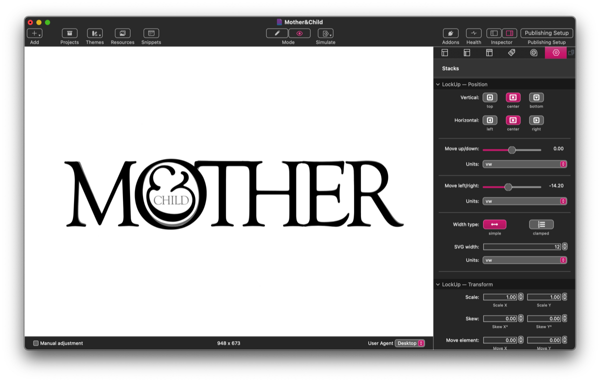
Herb Lubalin and his colleague Tom Carnase created this iconic masthead for a new publication. Their design was never actually used, but almost immediately it became a design classic, cementing Lubalin’s reputation as one of the most creative graphic designers of the twentieth century.
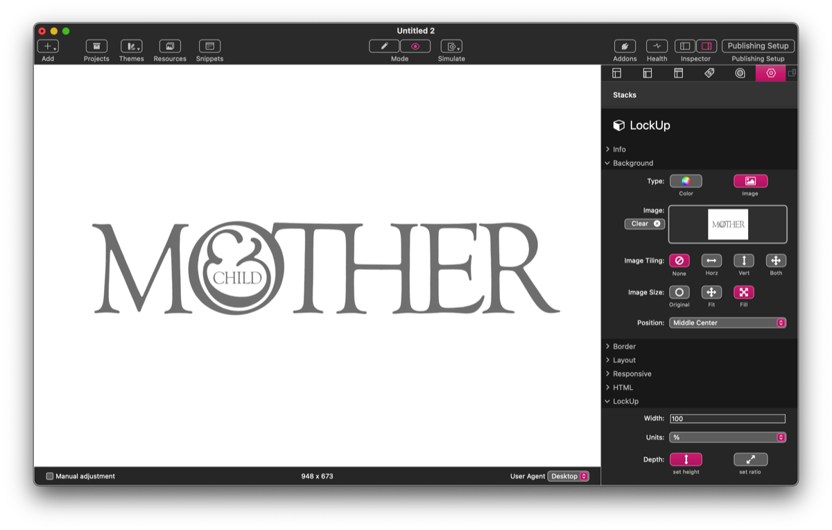
Recreating Lubalin’s famous masthead with LockUp isn’t the most obvious or efficient way to do so (you’d be much better advised to use a graphics app and save it as an svg) but it is a good example of how to work with the stack. And the first thing we need is an image to use as a template. I’ve taken a png from the web, reduced it to 50% opacity in Affinity Photo, and imported it in LockUp’s standard background controls. We can use this to position all the elements accurately, and then it can be deleted.
The other thing we need to retrieve from the web is the font. Lubalin used Goudy Old Style, but he would have used a headline verision for a Photo Typositor machine. We can see this in some of the features: the M, for instance, is much narrower than Adobe/Monotype’s text version. I found a free version from URW on Cufon Fonts that is similar to the one used in the original, but not quite the same, so we’ll have to adjust it on a letter by letter basis. Fortunately LockUp makes this relatively easy.
Step 1 — first letter
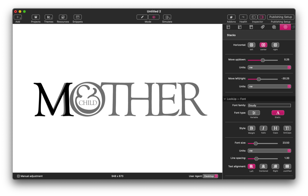
In the LockUpText child stack (LockUp creates the first one by default) I’ve just input the single character, M. Switching to Preview with the stack selected, I’ve kept the anchoring of the M as center-center (LockUp’s default) and we‘re going to leave the rest of the items anchored here too. I’ve then used the Font size, Move up/down and Move left/right to make the M the same size as the original and position it over the top of my template. Working with LockUp is a case of making smaller and smaller iterations until you end up with the size and position you want. In this case, though, it is clear that the font’s M is slightly wider than the original. Lubalin might have got Carnase to distort it on a PMT camera, or maybe they redrew it. But we can use LockUpText’s vertical scaling (in the ‘LockUp — Transform’ section of controls) to apply a small horizontal scaling.
Step 2 — the O
We’re going to use a separate LockUpText stack for each letter, so I have created a new stack for the O. Bear in mind that each successive layer is put in the front (and will appear at the bottom in Edit mode) — we can easily rearrange the order of stacks by dragging them up and down (or using Stacks 5‘s keyboard or menu commands). Unlike the M, the O is narrower than the original, which has been made wider to accommodate the custom ampersand. We size, position and scale it in exactly the same way as the M.
Step 3 — the other letters
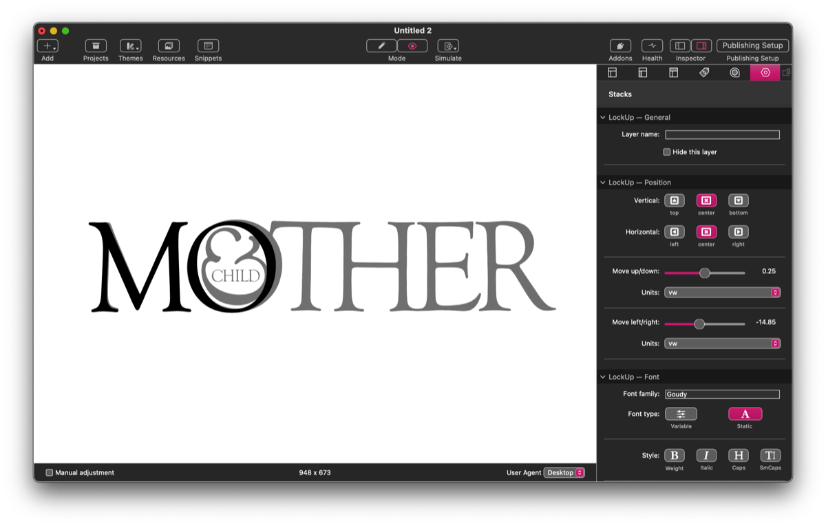
We do the same thing with the T, H, E and R. With the T, we need to take care to overlap it with the H so that there are no protruberances (in the last stage, I’ve created a white CSS rectangle in a LockUpText stack to make a smooth connection on the top of the T and the H, but this is a cosmetic refinement). In the original the H and the E also join smoothy on the bottom serif, but there is nothing we can easily do to achieve this.
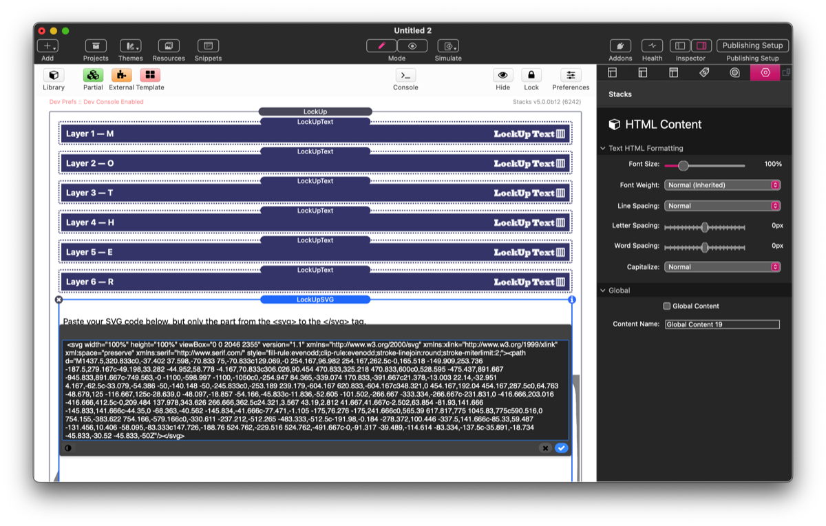
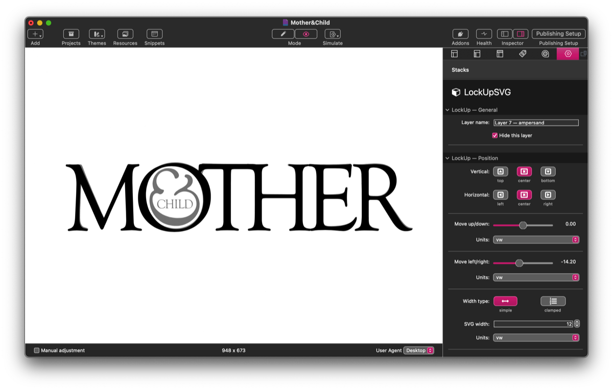
Step 4 — the redrawn ampersand
The key element of the masthead is the ampersand nested in the O. This is nothing like any Goudy Old Style ampersand, and I’ve redrawn it in Affinity Photo and saved it as an svg. I’ve opened the file in a text editor, copied the code between (and including) the svg tags and pasted it into a LockUpSVG stack. Otherwise I’ve treated it as the other letters, using LockUpSVG’s identical position controls and it’s simple width setting to place and size the ampersand correctly.
Step 5 — adding CHILD
The word CHILD can be created in a single LockUpText stack, as it only needs to be sized, positioned and letterspaced to match the orginal. And, with that, the masthead is finished. All that remains is to delete the template.
In the example I’ve used vw units, which size everything relative to the width of the viewport (device screen). One vw is 1/100 of the overall width. The only other unit I’ve used is em for the letterspacing of CHILD — em is preferable to all other units for letter- and word-spacing, because it is relative to the type size. In the final LockUp (below) you can see how it scales as you decrease or increase the viewport (for instance, in a browser’s ‘responsive design mode’). LockUp will also let you use the new ‘container’ units, of which cqw is the most useful. With a full-screen width item such as this, vw and cqw will appear and work the same way. But the parent LockUp stack is also set as a container, and using cqw units will scale the graphic according to the width of the container and not just the screen. Thus if I created the LockUp at full screen width but then dropped it into a container or grid stack, it would resize itself to the width of that stack.
M
O
T
H
E
R
CHILD